
About the project
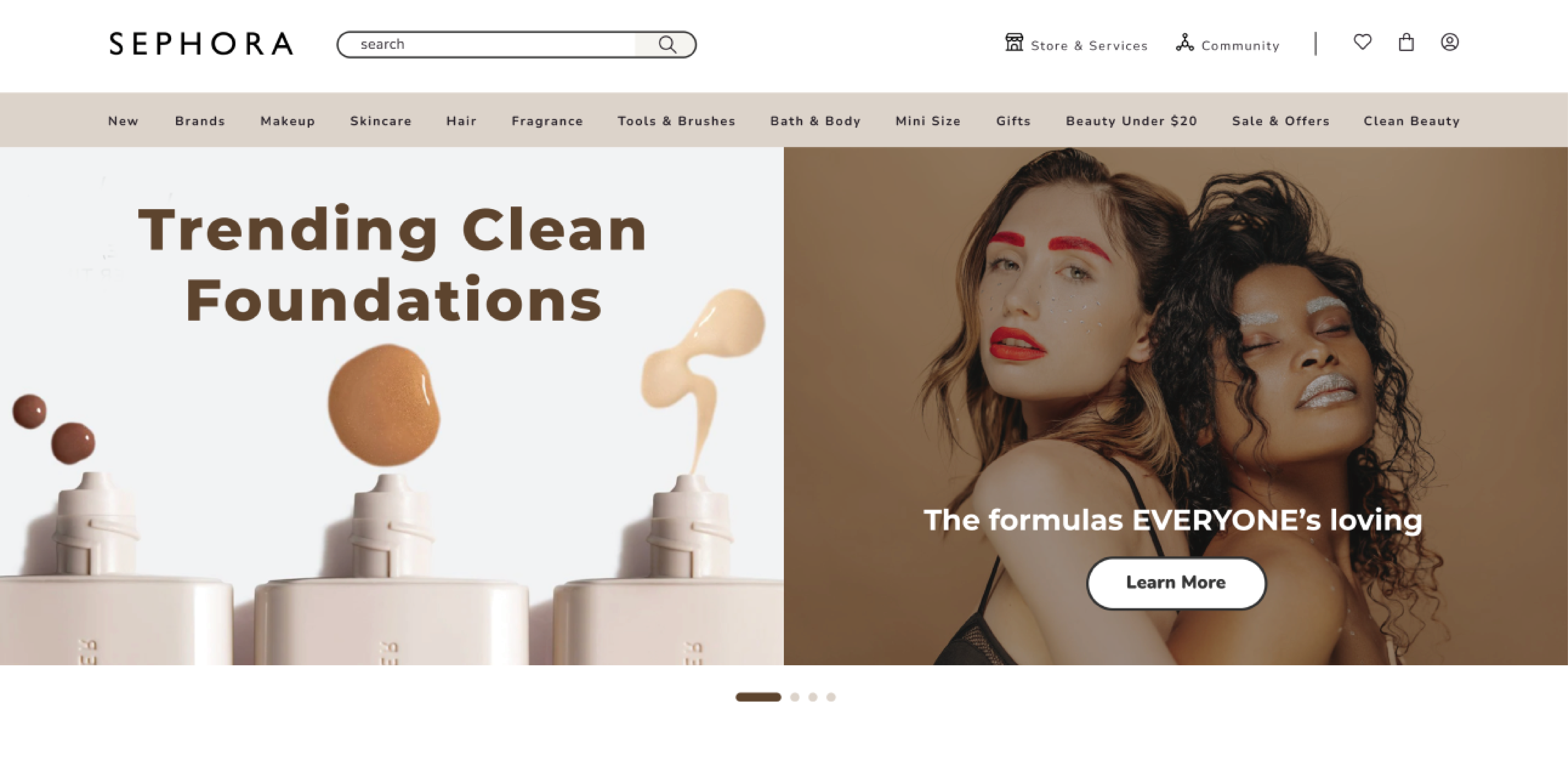
Sephora is a well-known beauty retailer that offers a wide range of cosmetics, skincare, and fragrance products. For this case study, I have chosen to focus on the user interface (UI) of Sephora's website. The goal is to analyze and improve the UI aspects such as layout, typography, colour pallet, navigation, and overall user experience.


Problem
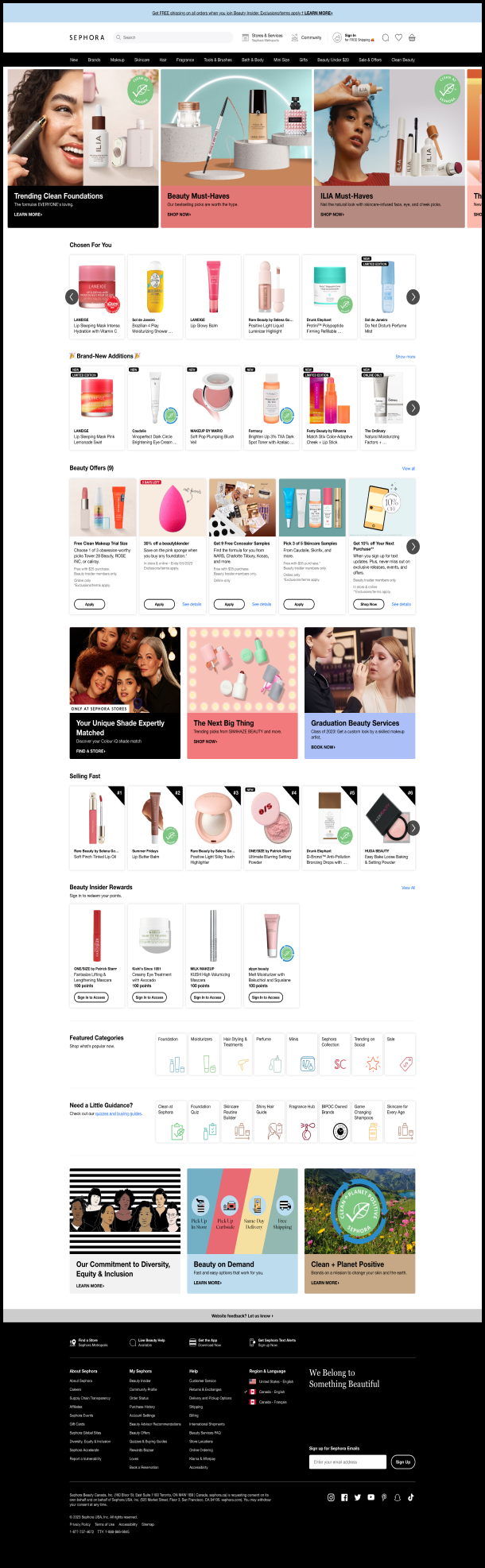
The current user interface of the homepage feels cluttered and uninspiring, while the categories page lacks clear organization. The layout and content hierarchy of both pages makes it difficult for users to prioritize and access relevant information, leading to a confusing browsing experience. Visual elements such as the colour palette and typography do not also effectively connect with Sephora's target audience.
Solution
Eco-conscious "cardboard" style is a design trend that incorporates recyclable aesthetics, reminiscent of faded papers and cardboard with spray paint. Using this style allows Sephora’s brand to showcase its commitment to sustainability and appeal to environmentally conscious consumers which is one of this brand's goals. To address the challenges faced by the current UI, the homepage design has been revamped and the categories page has been reorganized for improved clarity. visual elements also redesigned to creating a visually appealing and cohesive interface.

Colour Scheme & Typography
Eco-conscious "cardboard" style contains minimal typography, high contrast, and dimmed colours. This design approach follows strictly a 2D style, incorporating sharp edges and paper-like textures. To fully embrace this style, a carefully curated colour palette of Isabelline, Timberwolf, Coffee, White, and Black has been selected, complemented by the Nunito and Montserrat typefaces.


Design Assets

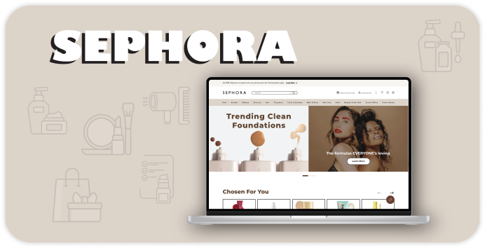
Home Page


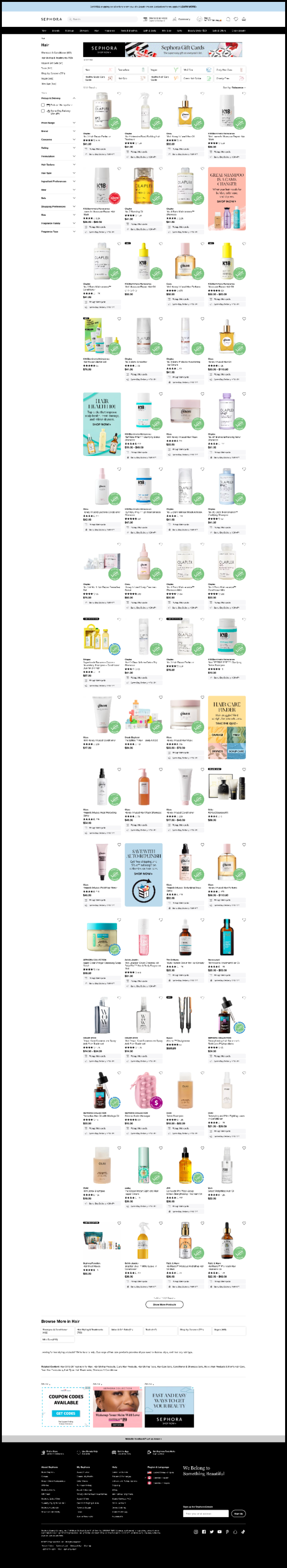
Categories Page


Retrospective
This case study highlights the importance of a user-friendly interface. By addressing the challenges and optimizing the layout and content hierarchy, the browsing experience and user satisfaction have been enhanced. Incorporating the eco-conscious "cardboard" style and aligning it with user preferences creates an engaging and sustainable design. This study demonstrates the positive impact of thoughtful UI design on user satisfaction, brand perception, and business success.