
- Role: UX/UI Designer
- Team Size: 4 Designers and 3 Developers
- Duration: January 2023 - April 2023
- Tools used: Figma, Illustrator, Photoshop, Trello, Zoom meetings
- Methods: Interviews, Usability Testing, Card Sorting, Wireframing, Prototyping
- Platform: Web Application
App Features


Main
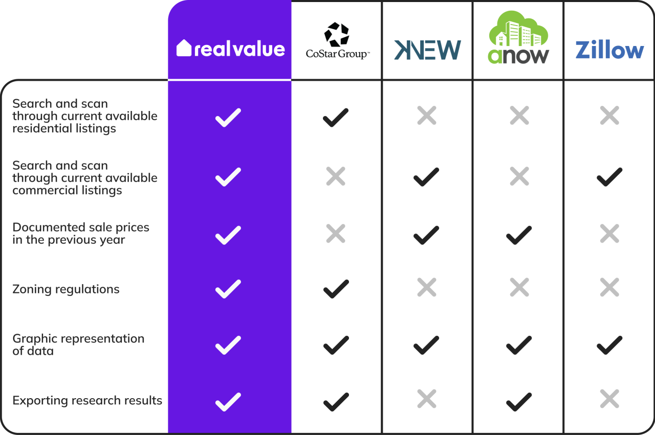
Competitors
My team and I performed analyses on 4 of the most widely used apps, in order to better understand our potential competitors in the market and how we can stand out by providing unique product offerings.
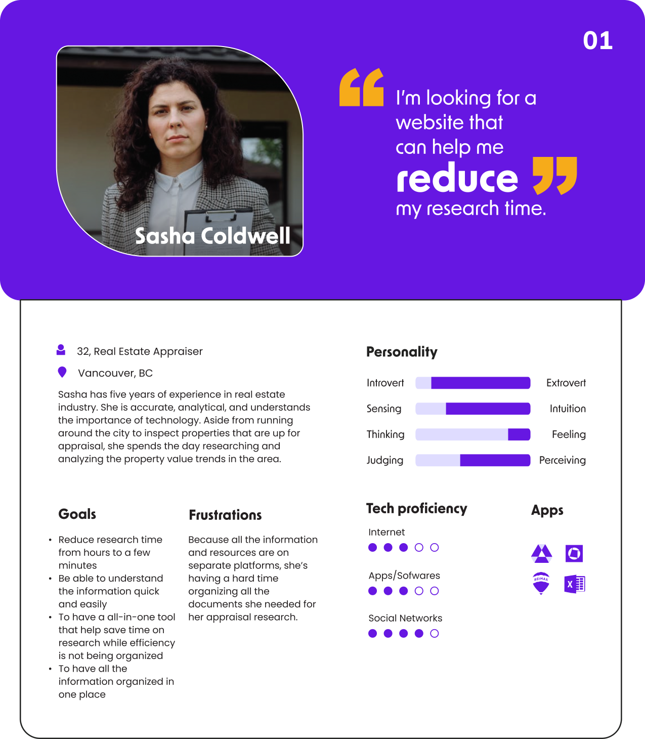
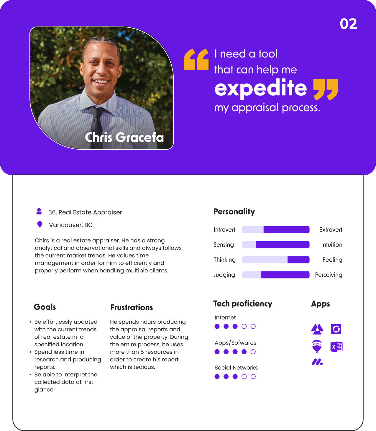
Personas
Based on the data gathered during our research, we developed personas to better understand our target users' goals, motivations, and challenges, which helped us better empathize with them and create design solutions that meet their needs.
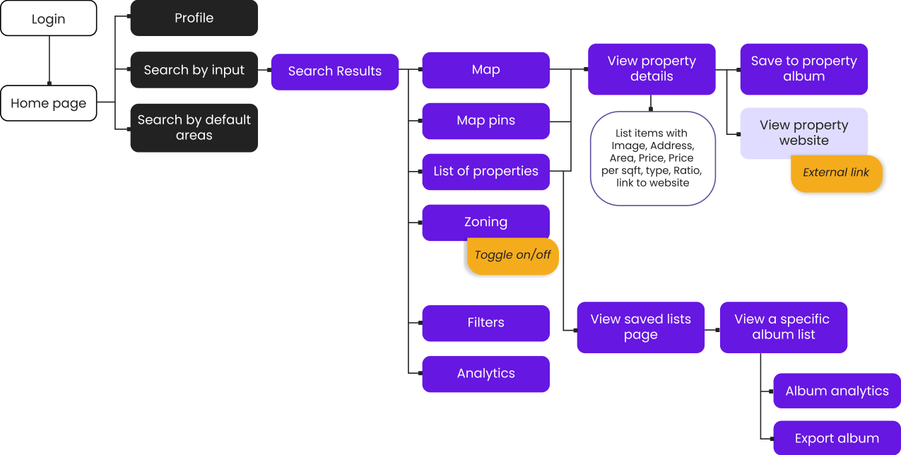
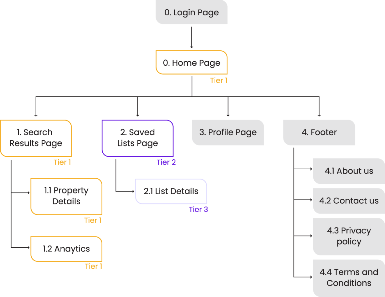
Sitemap
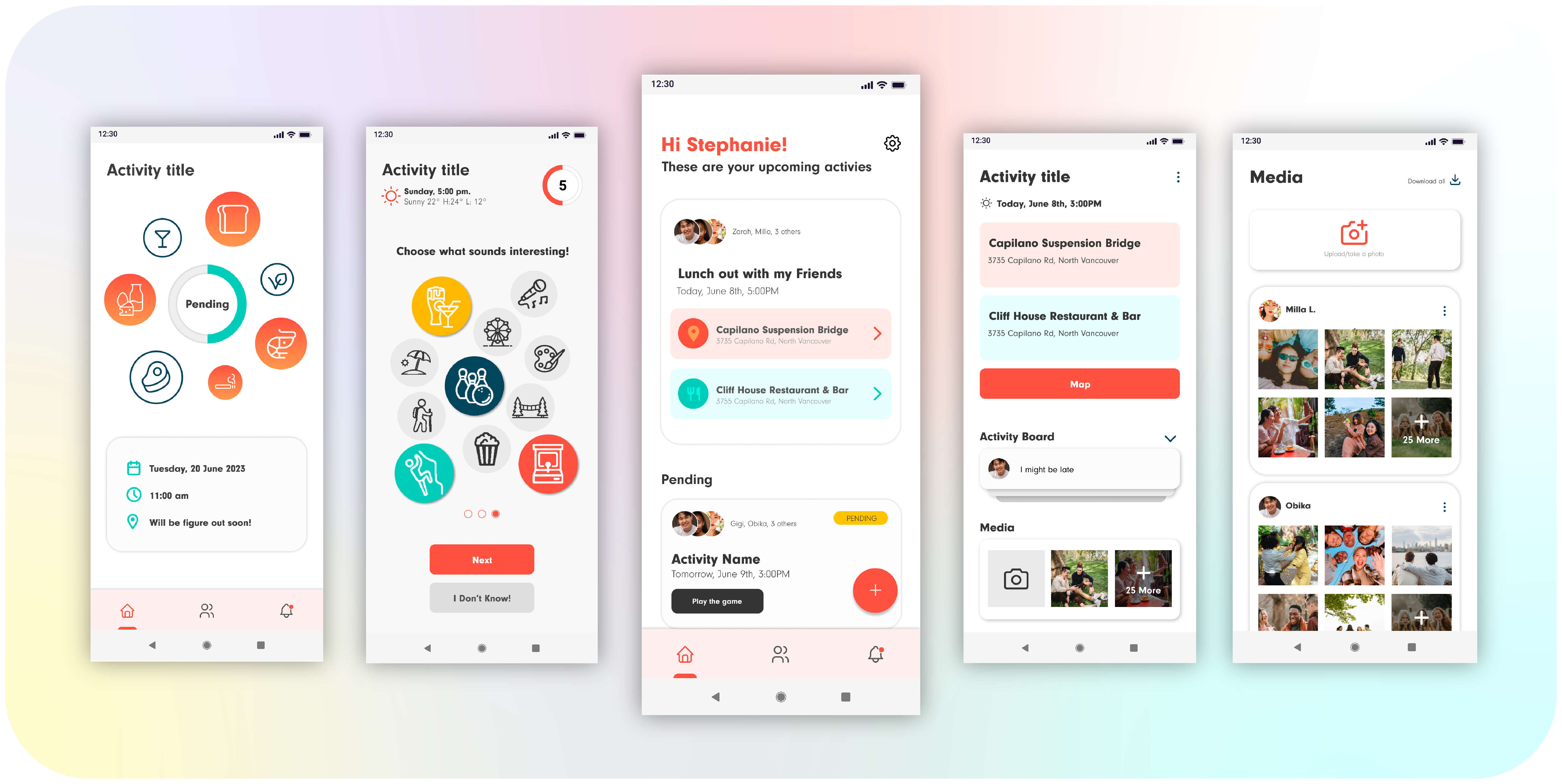
We used card sorting technique to categorize the information based on users understanding. This helped us understand how users anticipate the app's content to be displayed and organized.
Wire
framing
Tool: Figma
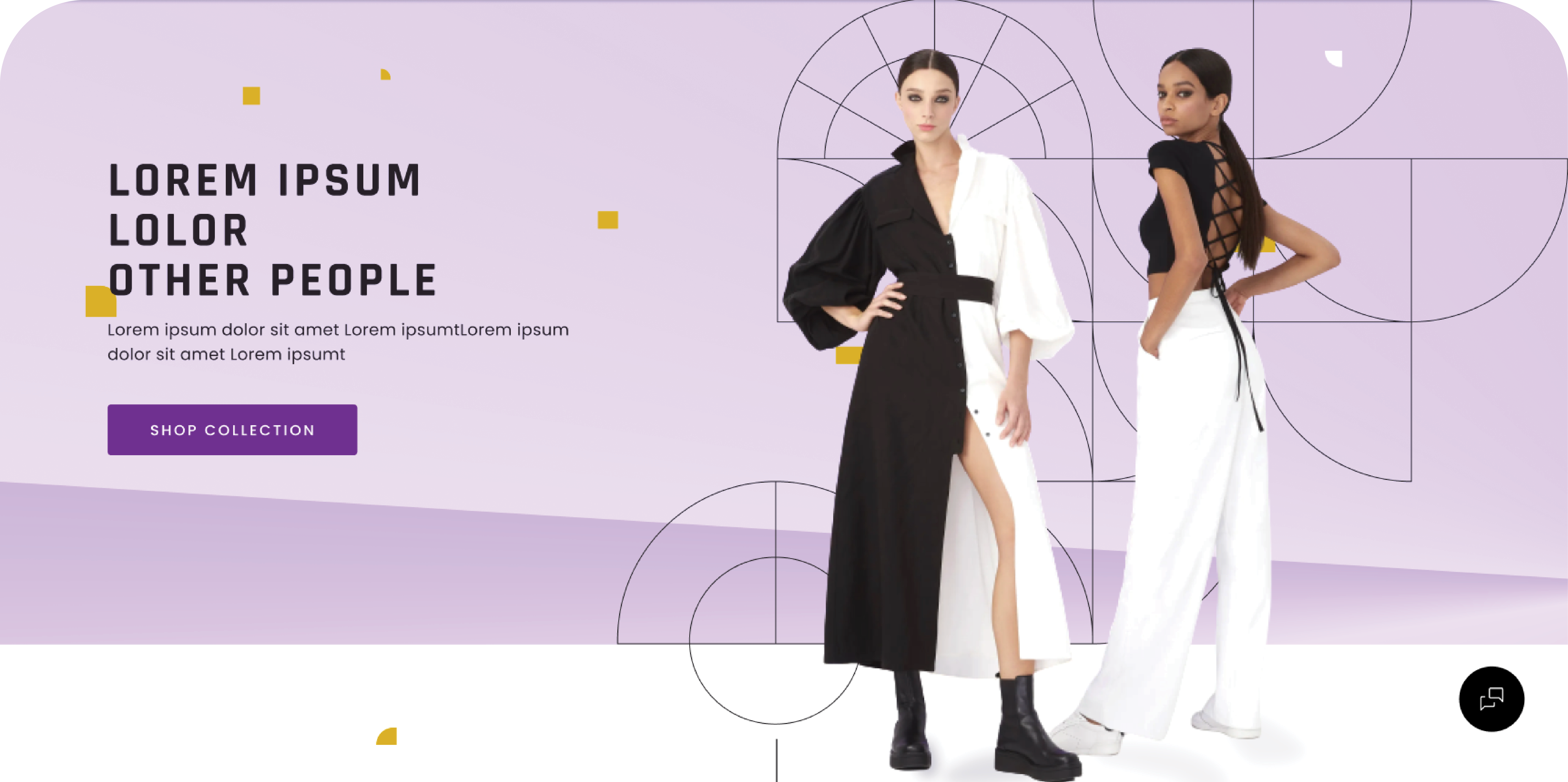
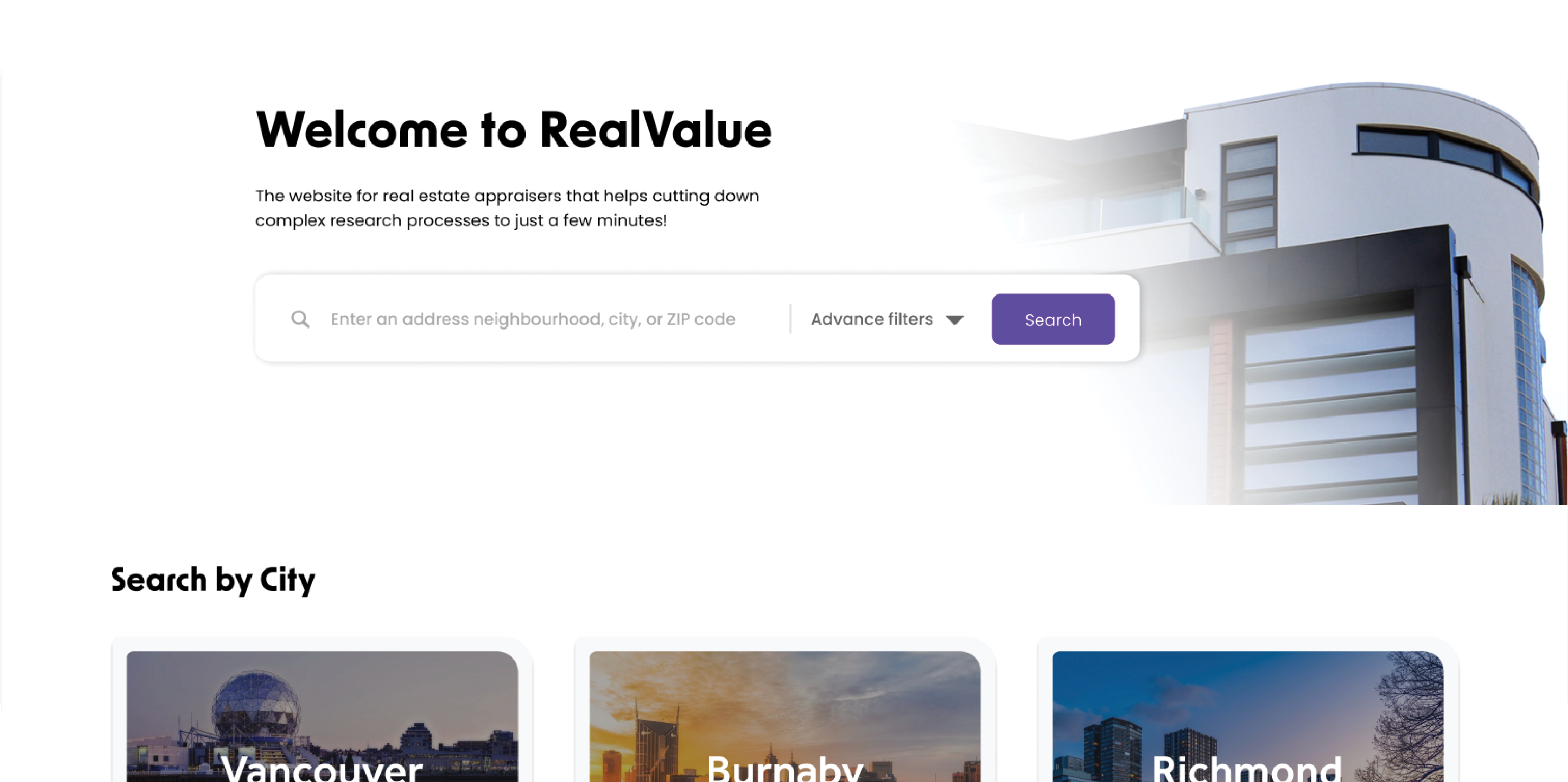
During the wireframing process, we started thinking about layout, font hierarchy, and design components to ensure that the design will work effectively in high-fidelity mockups. To guarantee that the web platform is fully responsive, the desktop and mobile wireframes were developed simultaneously.
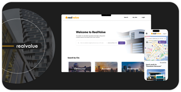
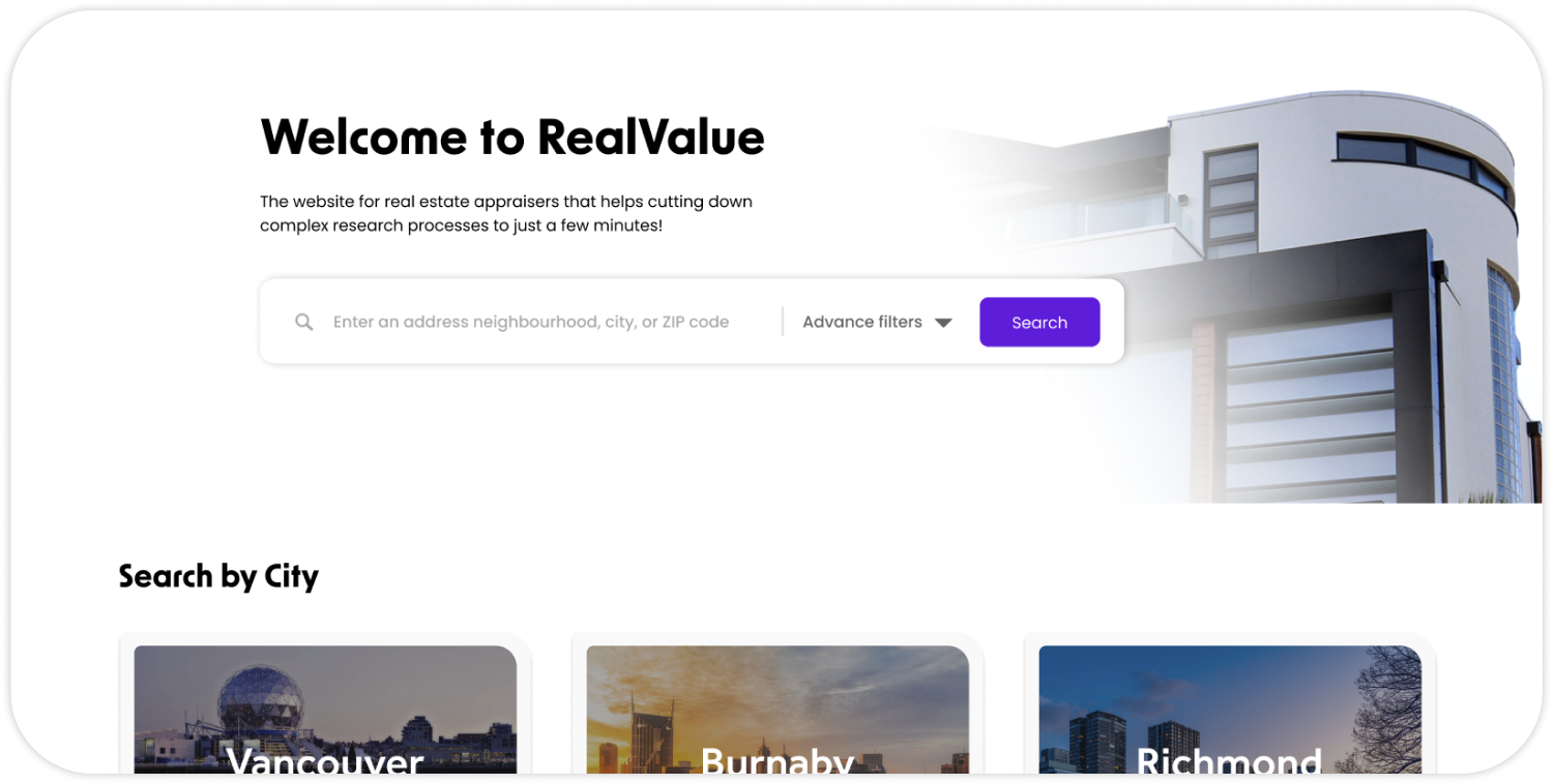
Home Page


Search results and Map


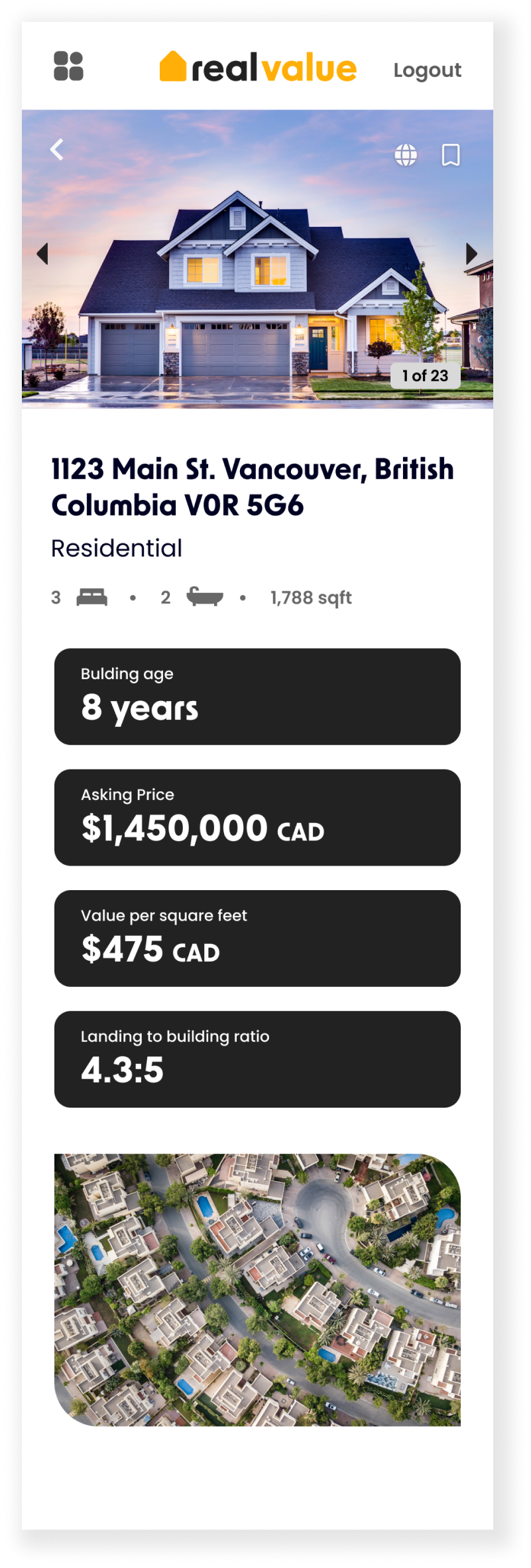
Property details


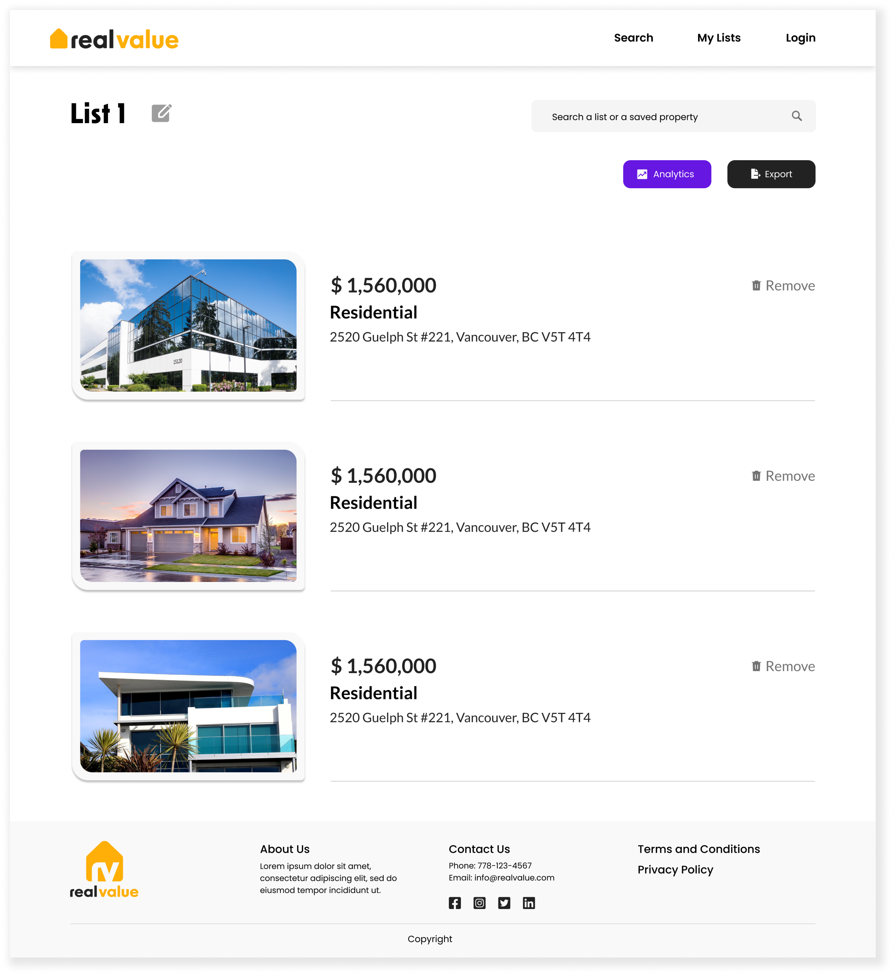
Saved Listings


Specific List

.png)
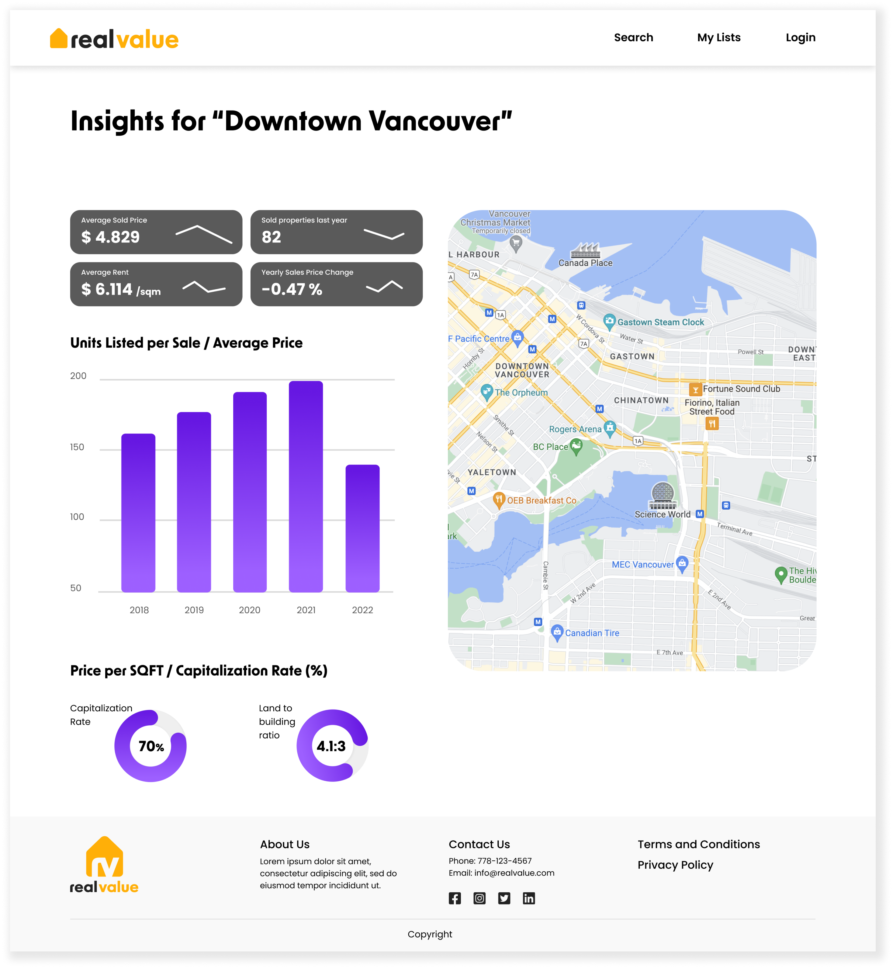
Analytics


Mockups
Tool: Figma, Illustrator, Photoshop
We used card sorting technique to categorize the information based on users understanding. This helped us understand how users anticipate the app's content to be displayed and organized.
Home Page


Search results and Map


Property details

Saved Listings


Specific List

Analytics

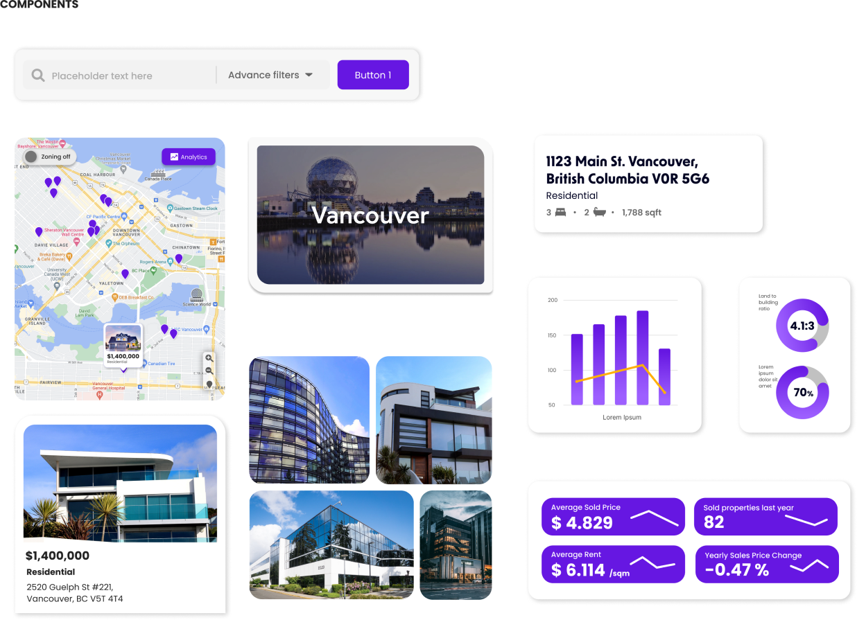
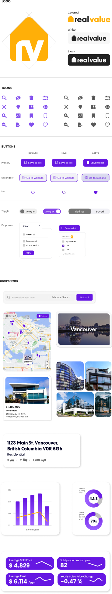
Design
Library
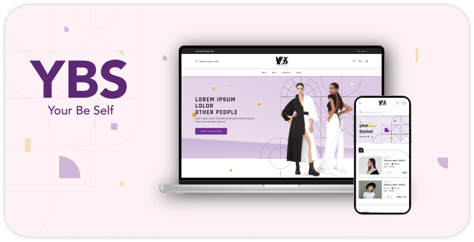
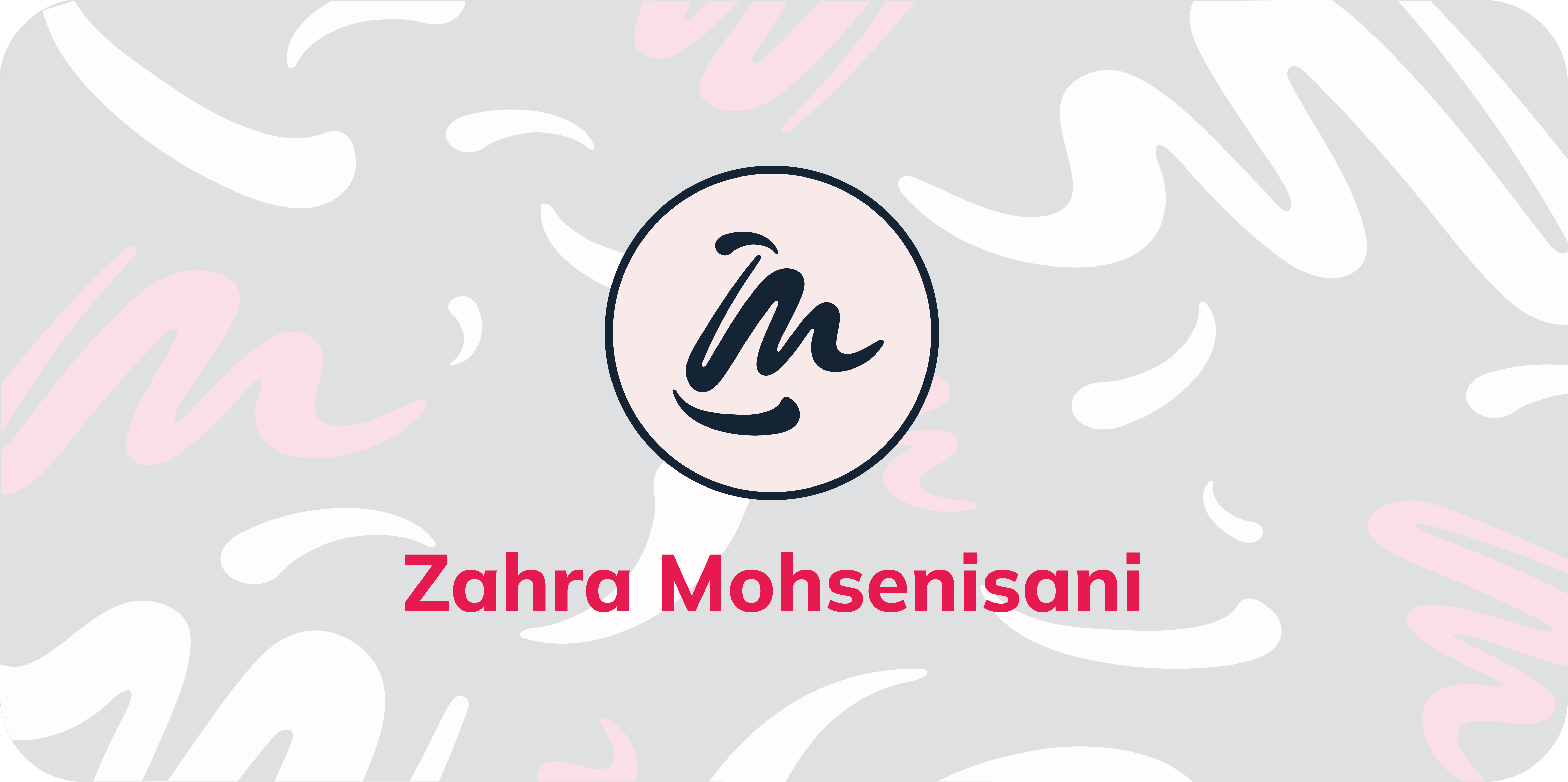
To ensure design consistency throughout the app the UI kits and components has been created. Our core values when creating the brand were always trust and efficiency, keeping in mind that we wanted to create a fresh and friendly interface as well. Those values has been represented in our logo by using a very clean typography, slightly curving the edges to give that modern look we wanted.
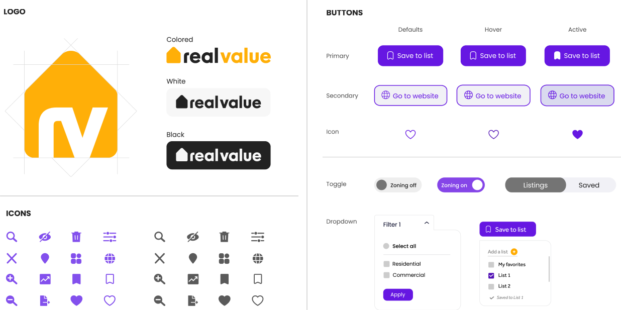
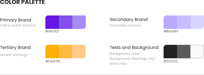
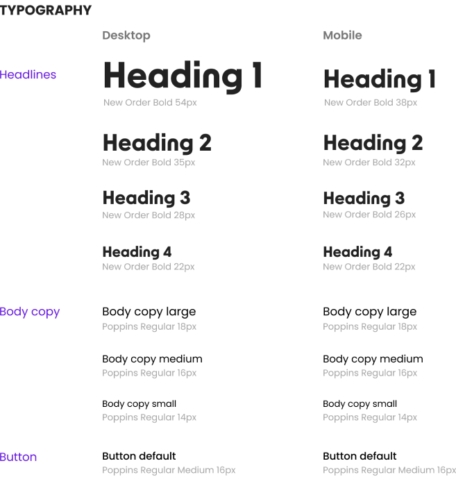
Color Palette & Typography
We chose purple as our primary color since it’s a color used in high-end brands that helps us communicate trust and efficiency, and yellow is our accent color because of its great contrast with purple and its vibrancy, perfect to highlight our calls to action. Our typographies, New Order and Poppins, have outstanding readability and are very clean as our logo to maintain a professional look all throughout our brand, where we carefully designed each icon and button so everything works together as a whole