
Project
Overview
Project Overview
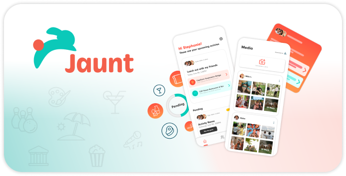
Jaunt is a mobile application that helps users decide what to do in their free time whether they are alone or in a group. Jaunt takes into account everyone’s personal preferences, mood, location, and budget, and uses this data to generate smart suggestions for the users involved.
Everyone needs entertainment as part of their lives. Nowadays we can find almost any form of entertainment but there’s so much availability that it has become harder to choose what to do. This has been a real problem among groups of friends and couples. There are many known jokes about how hard it is to decide where to eat or what to do with our significant other, and even though some have tried to solve this through applications that help people choose activities, the way they do it feels more like social calendars focused only on specific activities, such as restaurants and leaving aside the many forms of entertainment available. We want to provide a tool that helps users decide what to do by giving them and their companion a handful of options tailored to their desires, making sure that every time they get into our app, many new activities that fit their expectations will be found, fulfilling our goal: providing entertainment from the first interaction with our app until the activity chosen is finished.
- Role: UX/UI Designer
- Team Size: 4 Designers and 3 Developers
- Duration: May 2023 - Aug 2023
- Tools used: Figma, Illustrator, Photoshop, After Effects, Premiere Pro, Jira, Zoom
- Methods: Interviews, Usability Testing, Wireframing, Prototyping
- Platform: Mobile Application

.png)
Our
Solution
Our Solution
Jaunt seeks to save time for its users and save them from the long debates people usually go through when they are deciding what to do when they want to get together, or when there are so many options and different personalities and expectations that deciding becomes complicated, ending up in people doing nothing or even in some extreme cases, having fights. Having an app like this will allow users to have fun while they decide, and more importantly, they will be able to do it fast and get results that match what they all want.
Goodbye to indecision, hello to new experiences.App Features
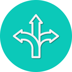
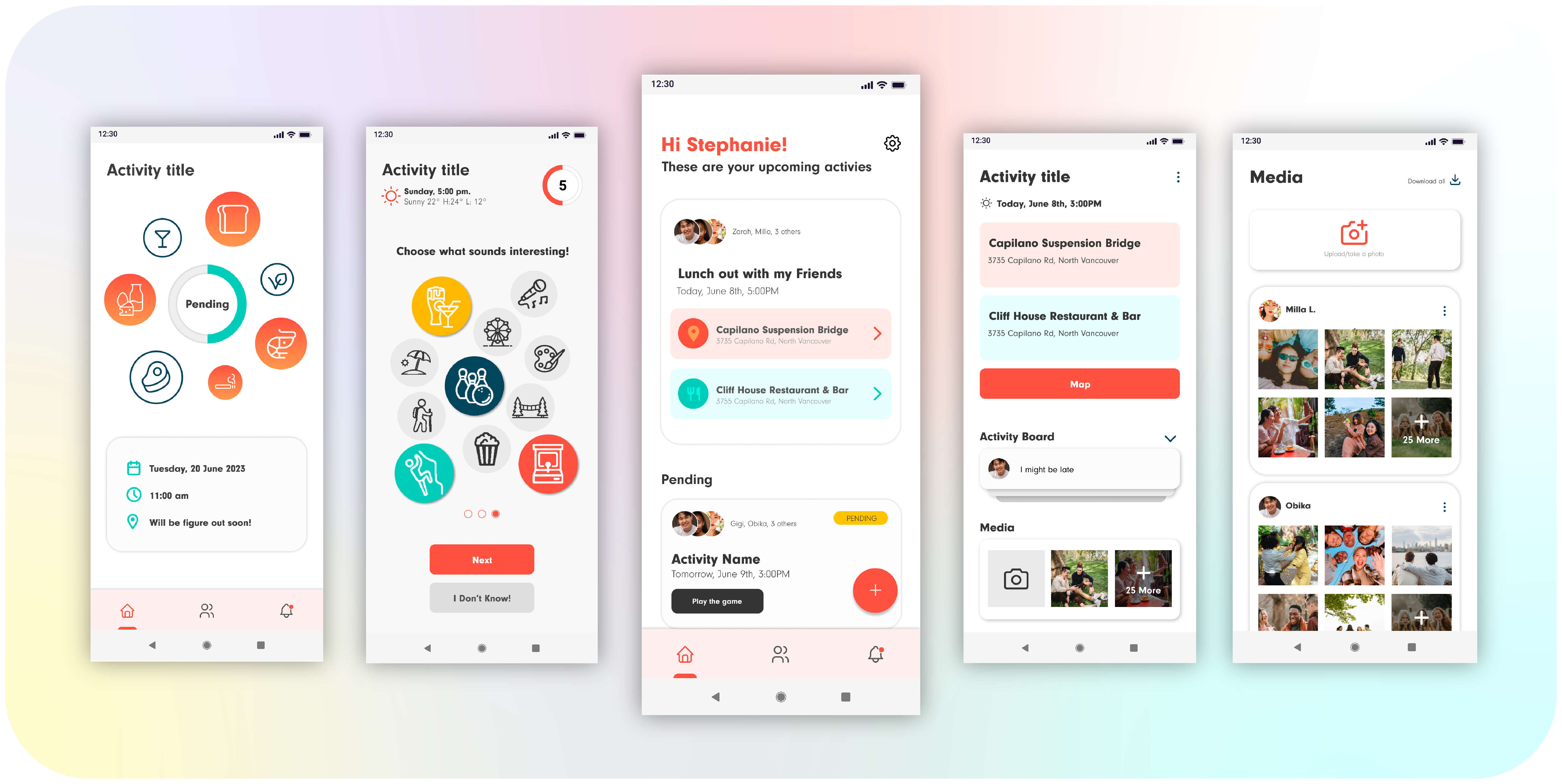
Decision Maker
Deciding on a place when going out can be challenging and time consuming. This feature addresses this problem by considering everyone’s personality rather than relying solely on one person's suggestion, ensuring that all users are taken into account during the decision-making process. Users will input their preferences, mood, and budget. Using this data and Artificial Intelligence, Jaunt will generate smart suggestions for the group, making it highly likely that everyone is interested in the options given.
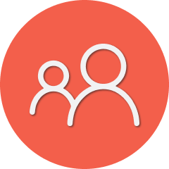
Group Dashboard
To make it possible for the users to interact and for Jaunt to be able to use everyone’s input, an Activity Dashboard is created where every user has the same permissions: Invite or remove members, create posts in an Activity Board, and upload or download media. From this Dashboard users will start an interactive quiz as well to set their mood. Once every member has done the quiz, the suggestions will be ready to be chosen. After the activity is finished, users have the option either to archive the group for future plans with the same people, or to delete it.
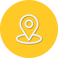
Geo-Location
It’s not only about deciding what to do, but also making sure to be there when the time comes. If we want to suggest people activities to do, we might as well tell them what is the best way to get there and how to get there on time so users can have everything within our app. Jaunt will automatically detect the users’ location and display routes to the destination by car, foot, bicycle, or public transportation. The departure time to be on time is displayed as well so everyone can get to the plan on time.
Main
Competitors
Main Competitors
We conducted analyses on four of the most popular apps in the market. Our objective was to gain deeper insights into our potential competitors and find out how and where we could innovate and create a unique value proposition for our target users.


Personas
Using the insights gathered from our research, we crafted personas to delve deeper into the goals, motivations, and challenges of our target users. This approach enabled us to gain a sense of empathy and understanding of their perspectives to create a seamless user experience that resonates with users needs.


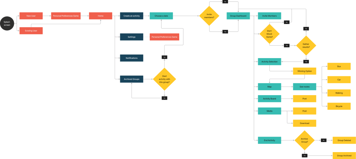
User Flow
During the user flow phase, we involved the developers to understand the sequence of steps and user interactions with the app.

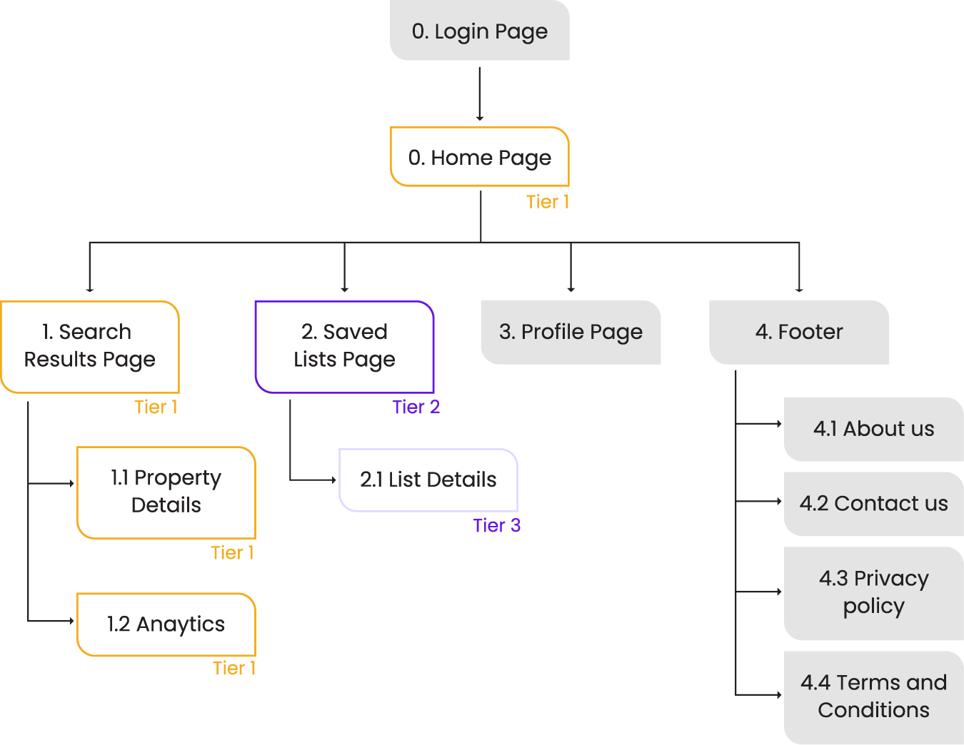
Sitemap
To develop the site map, we carefully organized and structured the app's information, ensuring a logical flow and easy navigation for users.

Wire
framing
Wire framing
During the wireframing process, we carefully considered the layout, font hierarchy, and design components to guarantee the seamless transition of the design into high-fidelity mockups.


Mockups
The main idea is for the users to have fun while making quick decisions which is why we implemented gamification by creating engaging interactions in surpassing the survey questions. Through further research, tests, and meetings with the developers, we came up with the final iteration which is a much more viable and improved design. The interface is now much neater and more organized, promoting usability and visual harmony across all screens while still keeping that playful feeling.


Design
Library
Design Library
Like our app name, Jaunt, we wanted to convey the idea of hopping from one place to another. That’s why we chose a bunny as our Logo. A bunny also symbolizes speed, representing quick decision-making with Jaunt. When choosing our colour palette, we envisioned a fun and playful lifestyle app, so we opted for vibrant and eye-catching colors that pop out nicely against a light background. The colours warm coral, capital blue, caribbean green, and bumble yellow, add a touch of excitement and playfulness to the app’s interface, making it visually appealing and enjoyable to use. We chose Neuzit Grotesk for our typography for its tall x-height which is great for strong legibility and contrast. In addition, this font has a rounded design, adding to the fun and friendly interface we aim to create. We applied the same design principles to our icons, buttons and components, where the edges are rounded to ensure a cohesive user experience throughout the app.